Create Eye-Catching CSS Buttons With Pseudo-Elements
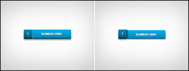
Today’s featured CSS tutorial comes from Sergio Camalich who created a very cool set of button designs with the use of CSS pseudo-elements. His tutorial shows you how to create buttons with a twist. It will only involve using just one anchor tag for each button to work (with the help of CSS), because you’ll be creating the other elements with the ::before pseudo-class.
Sergio created five different button styles using this one approach but I’m only going to show you just one of them, which actually happens to be my favorite one. If you like to see the rest of the styles, you can check them out on his dribble page.
The button that we’re going to create will look like this:
 Click on the image for the demo.
We’ll keep our HTML markup as short and simple as possible with this:
<a href="#">
Click me!
 </a>
And now for the magic of CSS:
.a_demo_three {
background-color:#3bb3e0;
font-family: 'Open Sans', sans-serif;
font-size:12px;
text-decoration:none;
color:#fff;
position:relative;
padding:10px 20px;
border-left:solid 1px #2ab7ec;
margin-left:35px;
background-image: linear-gradient(bottom, rgb(44,160,202) 0%, rgb(62,184,229) 100%);
border-top-right-radius: 5px;
border-bottom-right-radius: 5px;
box-shadow: inset 0px 1px 0px #2ab7ec, 0px 5px 0px 0px #156785, 0px 10px 5px #999;
}
.a_demo_three:active {
top:3px;
background-image: linear-gradient(bottom, rgb(62,184,229) 0%, rgb(44,160,202) 100%);
box-shadow: inset 0px 1px 0px #2ab7ec, 0px 2px 0px 0px #156785, 0px 5px 3px #999;
}
.a_demo_three::before {
content:"·";
width:35px;
max-height:29px;
height:100%;
position:absolute;
display:block;
padding-top:8px;
top:0px;
left:-36px;
font-size:16px;
font-weight:bold;
color:#8fd1ea;
text-shadow:1px 1px 0px #07526e;
border-right:solid 1px #07526e;
background-image: linear-gradient(bottom, rgb(10,94,125) 0%, rgb(14,139,184) 100%);
border-top-left-radius: 5px;
border-bottom-left-radius: 5px;
box-shadow:inset 0px 1px 0px #2ab7ec, 0px 5px 0px 0px #032b3a, 0px 10px 5px #999 ;
}
.a_demo_three:active::before {
top:-3px;
box-shadow:inset 0px 1px 0px #2ab7ec, 0px 5px 0px 0px #032b3a, 1px 1px 0px 0px #044a64, 2px 2px 0px 0px #044a64, 2px 5px 0px 0px #044a64, 6px 4px 2px #0b698b, 0px 10px 5px #999 ;
 }


