How to Create Vibrant Digital Poster Design with CSS3
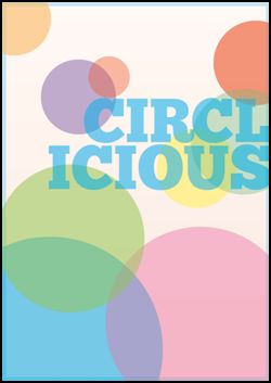
Chris Spooner shares a nice tutorial on how you can create a vibrant digital poster design with CSS3. His Circlicious design is made purely of HTML and CSS. Take note that this is only suited to modern browsers of Firefox, Safari and Chrome.
HTML
<!DOCTYPE html>
<html>
<head>
<meta charset="utf-8" />
<title>Circlicious CSS Poster</title>
<link href="style.css" rel="stylesheet" type="text/css" media="screen" />
</head>
<body>
<div id="poster">
<h1>Circl<br />icious</h1>
<ul>
<li>Large blue circle</li>
<li>Large pink circle</li>
<li>Large green circle</li>
<li>Medium Yellow circle</li>
<li>Medium green circle</li>
<li>Medium red circle</li>
<li>Medium purple circle</li>
<li>Small red circle</li>
<li>Small orange circle</li>
</ul>
</div>
</body>
</html>
Styling with CSS
body, div, h1, ul, li {
                    margin: 0; padding: 0;
}
body {
                    background: #eee;
}
#poster {
                    width: 895px; height: 1266px; margin: 100px auto;
                    position: relative;
                    background-image: -webkit-gradient(linear, 0% 0%, 0% 100%, from(#FEEADE), to(#FEF8F5));
                    background-image: -moz-linear-gradient(100% 50% 90deg,#FEEADE, #FEF8F5);
}
The #poster ul is styled with same dimensions, giving a 10px blue border. The rgba value allows the color to be specified in RGB format.
#poster ul {
                    width: 875px; height: 1246px;
                    border: 10px solid rgba(0,174,239,0.2);
                    position: absolute; list-style: none;
}
Each list item is given generic styling. Setting the radius to 50% works in Firefox while Webkit browsers need a required specific figure. The largest circle is 780px, so half this figure is 390px.
#poster ul li {
                    text-indent: -9999px; position: absolute;
                    -moz-border-radius: 50%;
                    -webkit-border-radius: 390px;
                    border-radius: 390px;
}
The :nth-child pseudo selector targets the lists based on their number, without needing any classes in the HTML. position:absolute; was added to the overall #poster ul li rule, so the actual positioning can be added directly to each item. Color is added in rgba format as a background-color.
#poster ul li:nth-child(1) {
                    width: 780px; height: 780px;
                    bottom: -280px; left: -220px;
                    background-color: rgba(0,174,239,0.5);
}
The clip is added to the parent #poster ul, creating a rectangle mask at the exact dimensions of the poster. Anything beyond this rectangular area is clipped.
clip:rect(0px,895px,1266px,0px);
Style up the same way with second circle. When setting the background color, it’s important to note to sample color from the design concept at 100% opacity, this will match the color when rgba transparency comes into play.
#poster ul li:nth-child(2) {
        width: 635px; height: 635px;
        bottom: -120px; right: -80px;
        background-color: rgba(236,0,140,0.3);
}
Repeat process for all the remaining list elements.
#poster ul li:nth-child(4) {
                    width: 260px; height: 260px;
                    top: 400px; right: 120px;
                    background-color: rgba(255,242,0,0.5);
}
#poster ul li:nth-child(5) {
                    width: 350px; height: 350px;
                    top: 290px; right: -80px;
                    background-color: rgba(43,182,115,0.3);
}
#poster ul li:nth-child(6) {
                    width: 290px; height: 290px;
                    top: 60px; right: -100px;
                    background-color: rgba(237,28,36,0.5);
}
#poster ul li:nth-child(7) {
                    width: 250px; height: 250px;
                    top: 190px; left: 130px;
                    background-color: rgba(102,45,145,0.3);
}
#poster ul li:nth-child(8) {
                    width: 140px; height: 140px;
                    top: 180px; left: 290px;
                    background-color: rgba(237,28,36,0.5);
}
#poster ul li:nth-child(9) {
                    width: 250px; height: 250px;
                    top: -80px; left: -90px;
                    background-color: rgba(252,176,64,0.5);
}
Chunk font is used for typographic element and with the @font-face rule, the font-file can be referenced for supporting browsers to put it in effect.
@font-face {
                    font-family: Chunk;
                    src: url("Chunkfive.ttf") format("truetype");
}
The #poster h1 is given absolute positioning and moved into place in the mid-right portion of the design.
#poster h1 {
                    position: absolute; top: 355px; right: -10px;
                    font: 210px/160px  "Chunk", Helvetica, Sans-Serif; text-align: right; text-transform: uppercase;
                    color: rgba(0,174,239,0.5); z-index: 10;
}
box-shadow is then added to the #poster rule to give a final visual effect.
-moz-box-shadow: 0 10px 20px #b0b0b0;
-webkit-box-shadow: 0 10px 20px #b0b0b0;
box-shadow: 0 10px 20px #b0b0b0;
To know more about Spooner’s tutorial, click on the image.
View the DEMO.


